DigiMEDSPA EMR
 DigiMEDSPA CONNECT ™
Compare Sales Across Locations
This user guide helps you compare sales across multiple locations to evaluate clinic performance. It shows how to access location-based sales data, interpret key metrics, and identify trends or differences between branches.
Understanding Terminologies
Sales
The total value of products or services sold by a clinic within a specific period. Sales reflect revenue generated and are used to measure clinic performance and growth.
Locations
The individual physical or operational sites where a clinic provides its services or products. Locations are used to track performance, compare results, and manage operations across multiple branches or outlets.
Compare Sales Across Locations
- The user can compare sales across locations by accessing the “Sales Reports” through Reports from two entry points.
- From the EMR Admin, click on “Sales Reports” under “Reports.”

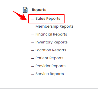
- From the Left Navigation, open the “EMR Admin” dropdown, select “Reports,” and then choose “Sales Reports” from the subsequent dropdown menu. Alternatively, you can type “Sales Reports” into the search bar in the Left Navigation.
- From the EMR Admin, click on “Sales Reports” under “Reports.”
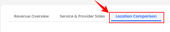
- The Revenue Overview tab opens by default. To view the sales comparison across locations, click on the “Location Comparison” tab.
- To compare sales across locations, set the Start and End Dates, select the Location, and then click “Apply” to filter the data for the specified period.

- At the top of the screen, key metrics for the selected period are displayed, including Total Revenue, Active Locations, Top Location, and Average Revenue Per Active Location.
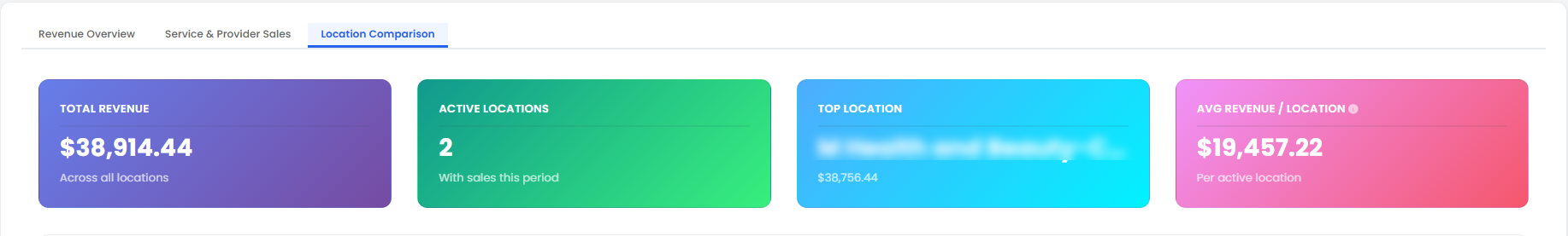 Note: “Total Revenue” is the overall income generated from all sales across all locations during a specified period. It represents the business’s total earnings. “Active Locations” is the number of locations that have recorded sales or transactions within a selected time frame. This indicates which branches are operational and contributing to revenue. “Top Location” is the location that generates the highest revenue or demonstrates the best performance during a given period. It highlights the most successful branch. “Average Revenue Per Active Location” is the total revenue divided by the number of active locations, showing the average earnings per branch. This metric helps compare performance across locations fairly.
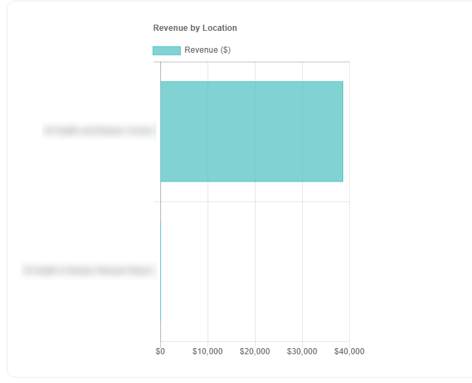
 - Review the bar graph displaying the Revenue by Location, where locations are listed along the Y-axis and their corresponding revenue values are shown on the X-axis.
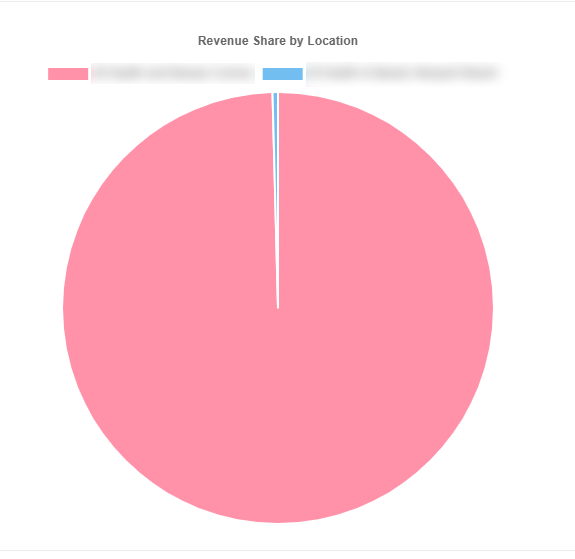
- Review the pie chart displaying the Revenue Share By Location.
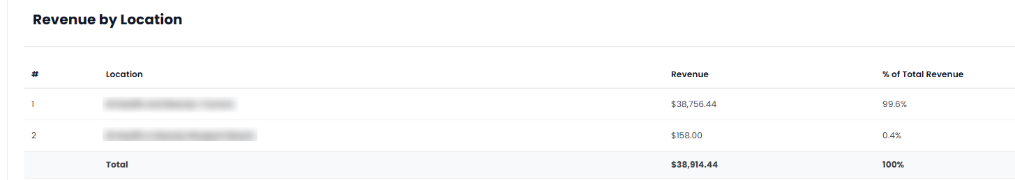
- Below the graphs, you’ll find a detailed breakdown of Revenue by Location, including the revenue amount and percentage total revenue.